
Reframing construction for a changing world
Cities are growing, communities are shifting, and the way we build needs to adapt faster than ever. Yet construction is still dominated by rigid methods, slow timelines, and high costs. Modular containers offer speed and flexibility — but too often, the market saw them as temporary fixes rather than permanent answers.
BOXTUO, a Polish modular construction company, wanted to break that perception. They weren't just delivering steel boxes — they were shaping adaptive environments for work, living, and community. The gap wasn't in what they built. It was in how the world understood it.
Starting with a question, not a brief
Before any design work began, the question wasn't "what should the identity look like." It was: why do people still see modular as temporary? Conversations with BOXTUO's clients, partners, and community stakeholders surfaced the same pattern — nobody was actually attached to the structure itself. What they valued was how a space adapted to their lives: flexibility, connection, room to grow. That insight became the brief's real foundation, long before a single visual decision was made.
An identity built the way BOXTUO builds
The decision to base the visual system on container geometry wasn't aesthetic first — it was strategic. If BOXTUO's product story was "adaptive, modular, scalable," the identity had to prove that claim structurally, not just illustrate it. Grids became a design principle instead of a layout tool: strict enough to feel engineered, flexible enough to expand across any application the brand would need next.

Designing for a brand that crosses borders
BOXTUO wasn't selling into one market — outreach spanned Poland, Slovakia, China, and LATAM. That constraint shaped the whole system: nothing could rely on a single language or a single cultural read to land. Every proposal, every brochure, every touchpoint needed to hold its impact in translation, literally and visually.

The proposal system followed the same logic — designed less like a sales document and more like the opening page of a pitch for the future, something that could open a room instead of just filling an inbox.
The detail that carried the most weight
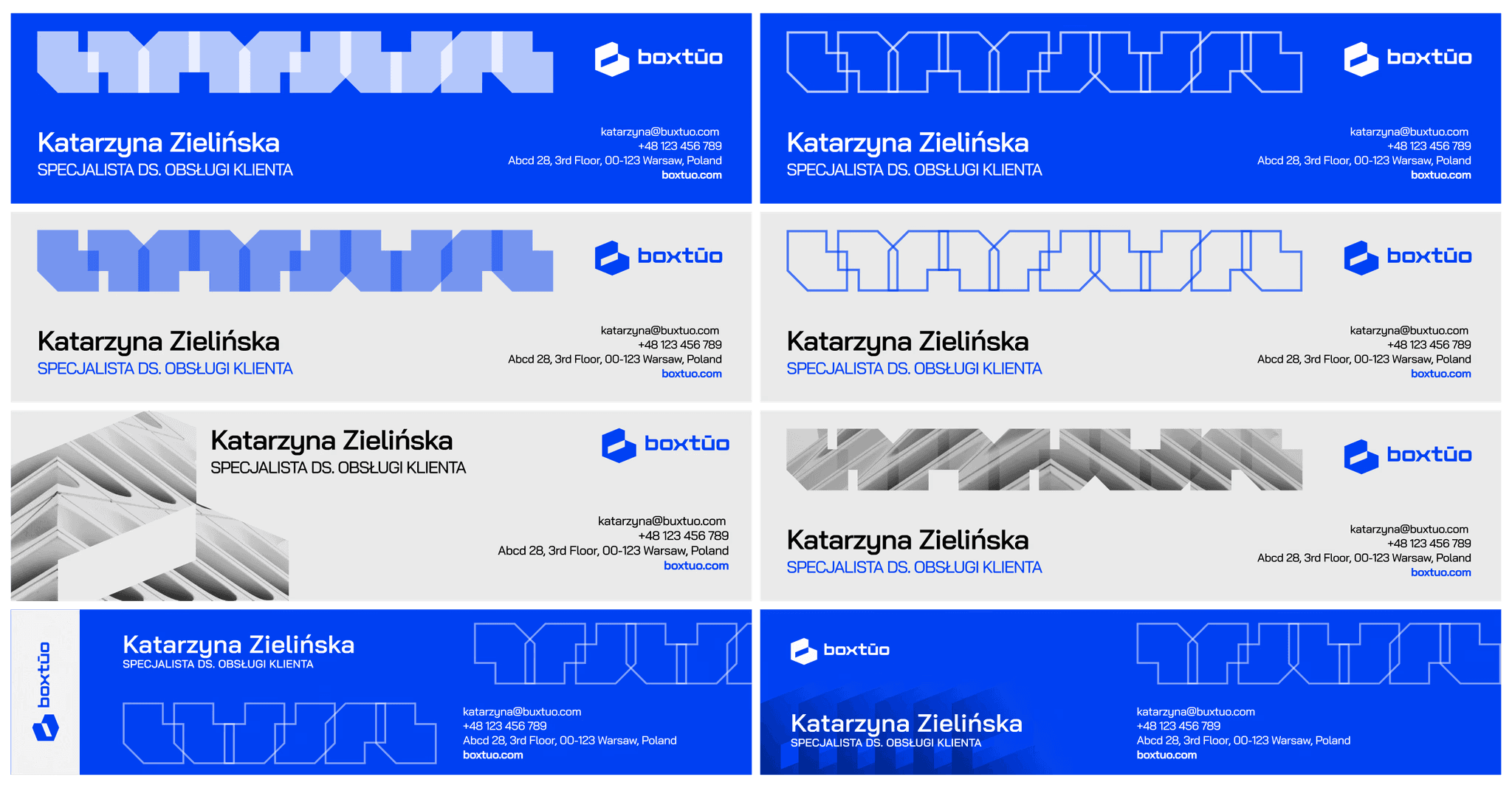
One of the more counterintuitive calls in the project was treating the email signature with the same rigor as the proposal cover. In B2B outreach across four markets, the signature wasn't a footer — it was the actual first impression, opened before anything else in the deck. Formatting it consistently across languages closed a gap that the bigger, flashier touchpoints couldn't fix on their own.
From box to possibility
The shift showed up quickly. Inbound inquiries rose 35% as the new positioning reached the market, and the modular identity's grid-based structure meant 90% of assets could be reused and adapted across every market it entered — proof that the "adaptive" story wasn't just a claim, it was how the brand actually operated.
Clients stopped seeing modular construction as a compromise and started seeing it as the smarter, more sustainable path forward. Internally, BOXTUO's team gained something just as valuable: a brand story that finally matched the scale of their ambition.

BOXTUO now stands as proof that containers aren't the limit of construction — they're its evolution.