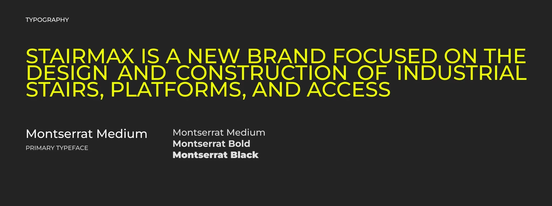
It started with another industrial re-branding work
Fresh identity. Sharper proposals. Outreach materials that didn't look like every other supplier in the room.
Then STAIRMAX saw it.
“We want to feel like that too.”
STAIRMAX builds industrial stairs, platforms, and access systems—products where precision is everything, yet the companies behind them often look remarkably alike.
Same visual language. Same technical catalogues. Same forgettable proposals.
The engineering was already there.
The opportunity was to make it visible.
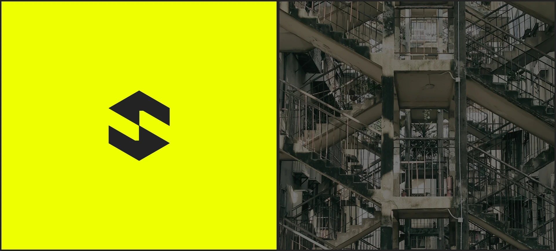
Engineering a brand from zero
The transformation started at the smallest mark and expanded outward.
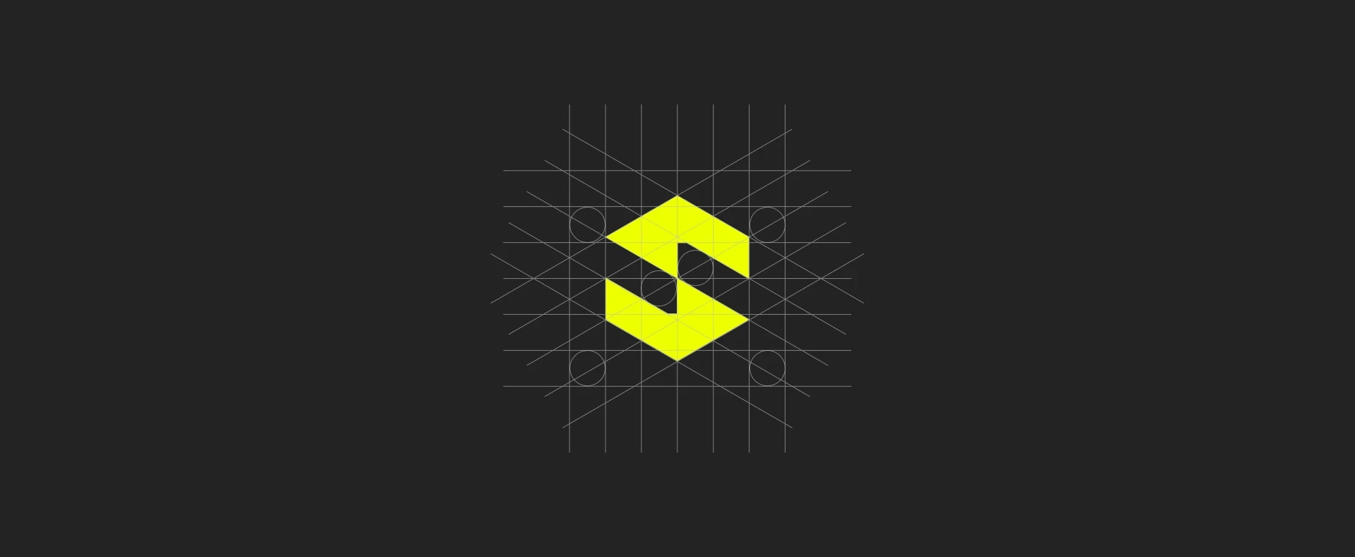
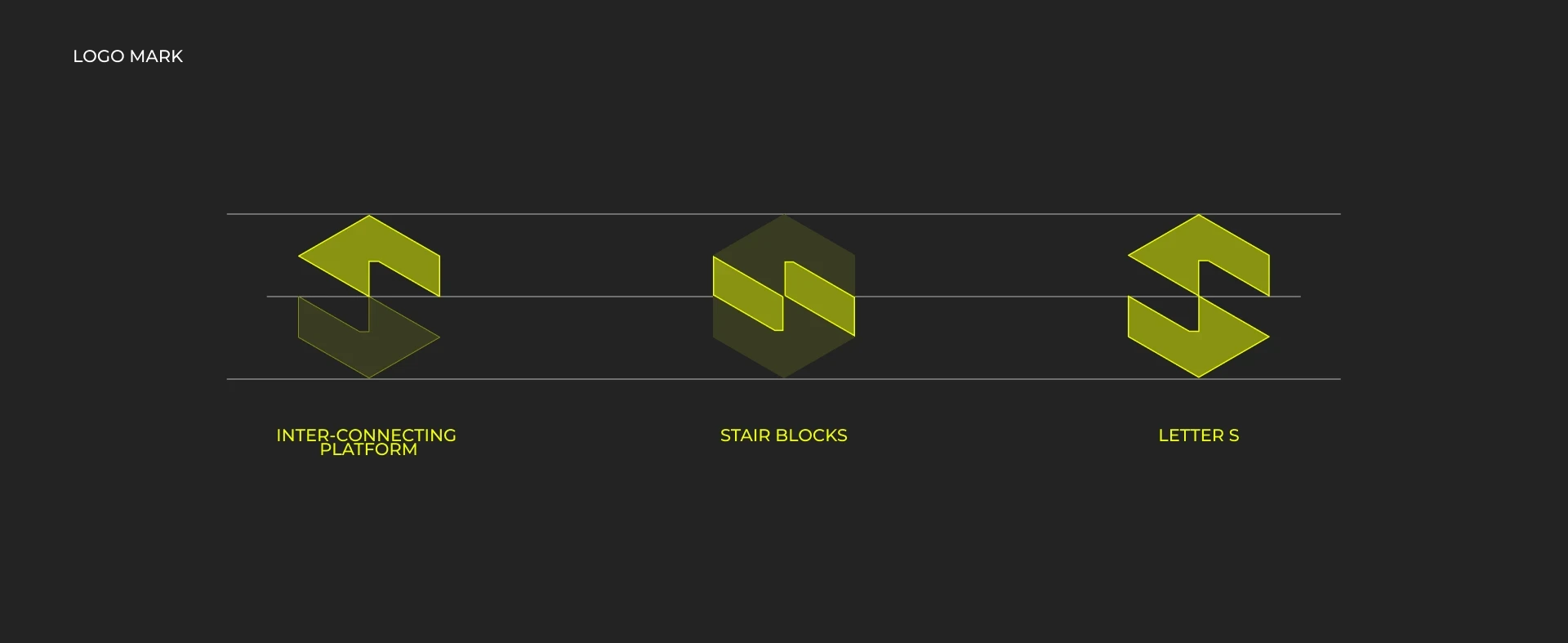
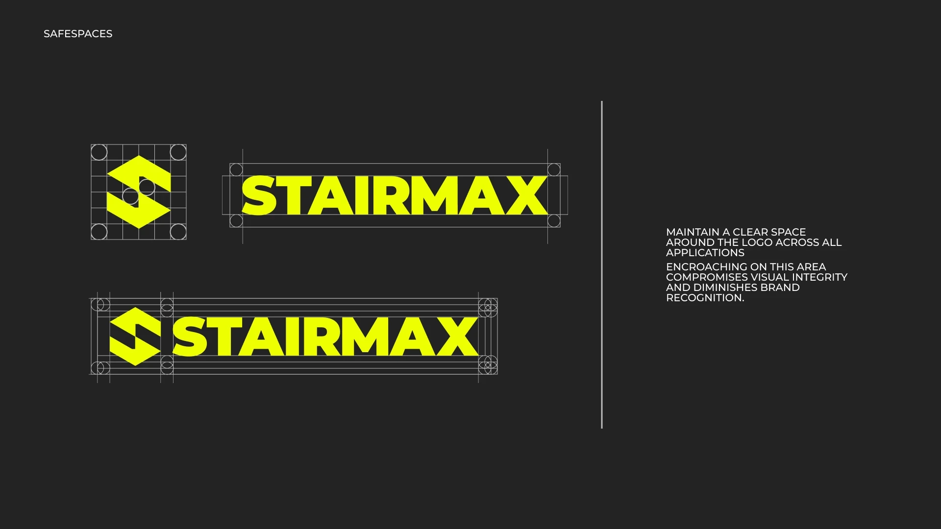
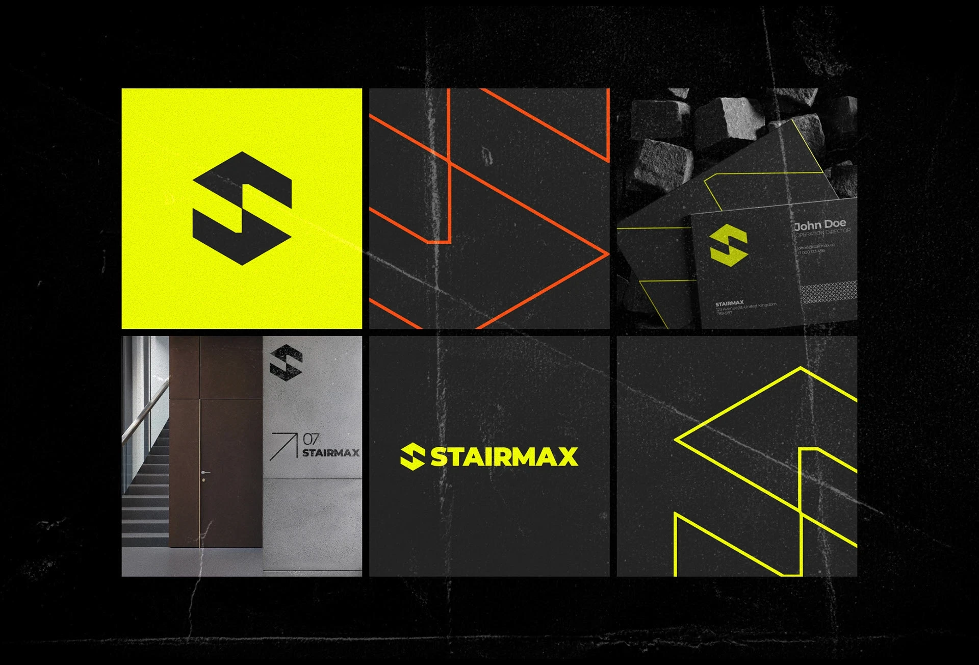
A new logo became the foundation for a complete visual identity. Structure informed the design language: precise geometry, strong typography, systematic layouts, and a visual rhythm inspired by the engineered products themselves.
From there, the system grew.
Proposal decks. Technical documents. Product brochures. Sales presentations. Digital materials. Trade fair graphics. B2B outreach.
One identity, built across every major client-facing touchpoint.
This wasn't about making an industrial company look fashionable.
It was about making STAIRMAX recognizable before a salesperson even started talking.
Boring industries don't have to be 'boring'…
Unlike B2C, industrial B2B is rational. Yet, the people making the decisions are still human.
A procurement manager might compare specifications and prices, but they also have to remember suppliers, present options internally, recommend a partner, and feel confident putting that company in front of someone else.
So the identity had to work harder than simply looking consistent.
Every touchpoint became part of the pitch.
The proposal carried credibility.
The brochure created recognition.
The presentation helped frame the conversation.
The trade fair materials made the company visible in a room full of competitors.
What began as branding became a full-suite communication system for market outreach.
Making precision sell
The biggest shift wasn't one asset.
It was what happened when all of them started speaking the same language.
100% identity coverage across the designed client-facing system.
One visual language from technical communication to marketing outreach.
Zero need to reinvent the brand every time a new sales material was created.
That consistency gave STAIRMAX something industrial suppliers often underestimate: presence.
A stronger first impression. Faster recognition. More confidence entering client conversations. And a brand the team could actually be proud to put in front of the market.
Branding didn't replace the engineering.
It made the engineering easier to recognize, trust, and remember.
Industrial was never the problem
The assumption was.
That technical businesses don't need brands. That procurement only notices specifications. That looking like everyone else is somehow more professional.
STAIRMAX became the opposite argument.
From logo to design language, from proposals to market outreach, the entire identity was built to make one industrial company show up as one recognizable business.
Not louder.
Not less technical.
Just much harder to overlook.
010
©